Mental Health App Mascots: Calm States and Crisis Rules
By the Charmotion team · Updated
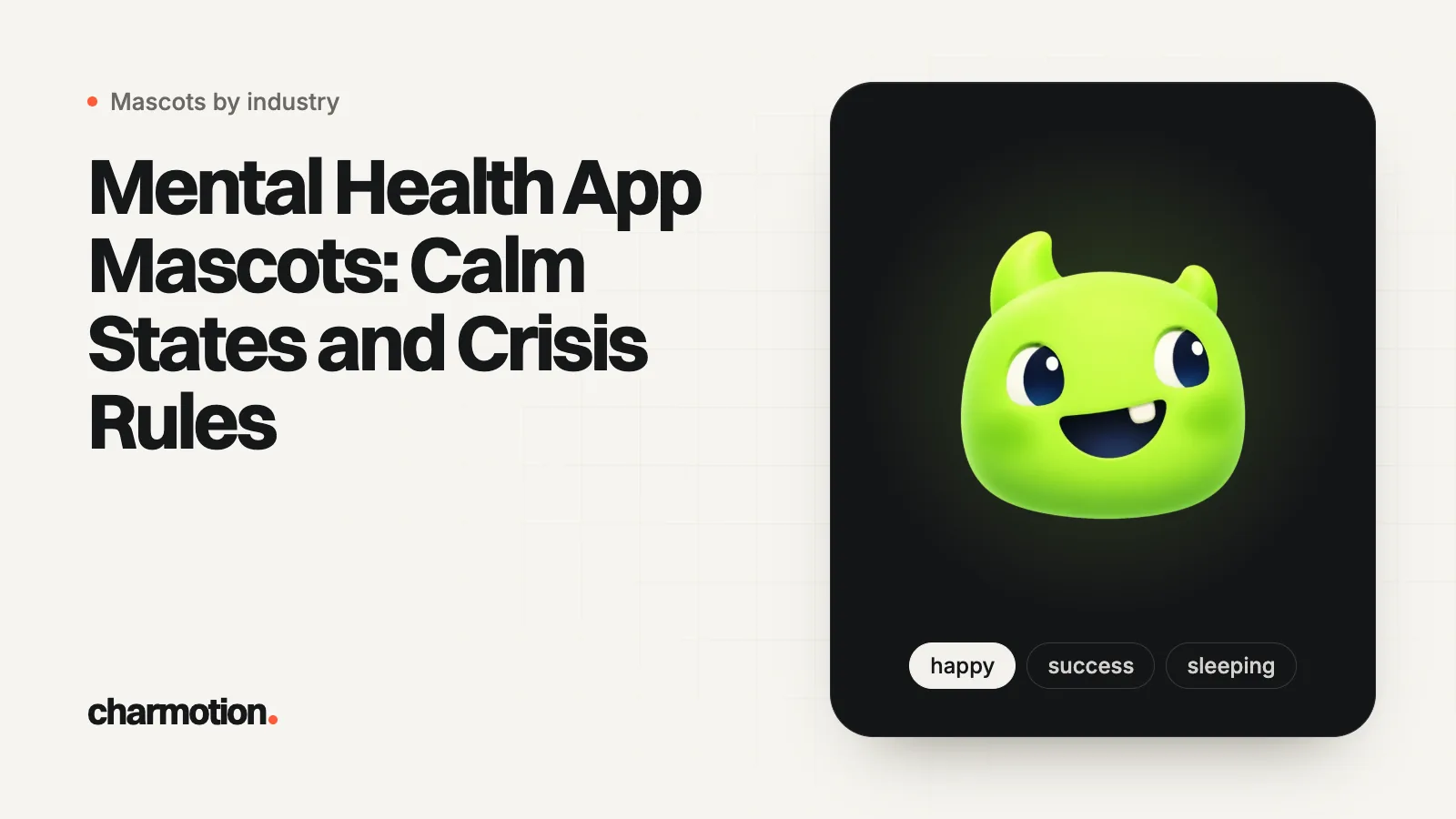
A mental health or self-care app mascot should move slowly and stay quiet: a calm idle, listening while the user writes, thinking while content loads, sleeping for wind-down and a soft happy after an exercise. Never use error, no or sad reactions on a user's feelings, follow reduced-motion settings, and keep the mascot off crisis screens entirely.
Key takeaways
- Five calm loops cover most screens: idle, listening, thinking, sleeping and happy.
- Error, no and sad judge the user when they appear next to a mood entry or a journal; reserve them for app faults or leave them out.
- Crisis flows need one clear action, a crisis button in a fixed place and no decorative motion.
- Follow Reduce Motion and WCAG 2.3.3, and give long loops a pause or hide control.
- This guide covers self-care, journaling, meditation and mood tracking; health chatbots have their own guide.
Already have a character or logo? See your character in real app screens: splash, onboarding, loading and empty-state screens. It's free, runs in your browser and uploads nothing.
What job should a mascot do in a mental health app?
Company, not therapy. In self-care and mood apps, a character can make a daily check-in feel less clinical and give a quiet sense of presence. Wysa is a known example: a University of Pittsburgh student resource describes it as talking to "a cute, tiny penguin" that uses CBT techniques and replies with GIFs and emojis (University of Pittsburgh).
Three limits keep the character honest:
- It doesn't diagnose or promise outcomes. The mascot reacts to what the user does in the app; it never comments on how they "really" feel.
- It isn't a friend substitute. If the app includes an AI chat, Nielsen Norman Group warns that humanizing AI raises the risk of overtrust and of users forming emotional bonds with the product (NN/g). A non-human character with simple states is safer than a human-like persona.
- It can always be turned off. Some users want the tools without the character, especially on bad days.
If your product is a health assistant that answers medical questions, read the healthcare chatbot avatar guide instead: disclaimers, urgent advice and conversation states are covered there.
Which states fit mood logging, journaling and meditation?
Use the quiet half of the set. Most screens in a self-care app need a character that is present but not performing.
| Moment | State | Notes |
|---|---|---|
| Home screen | idle (0) | The default; slow and low amplitude |
| Choosing a mood or writing a journal entry | listening (6) | Shows attention without reacting to content |
| A low mood is logged | listening (6) or idle (0) | Never sad, no, or error |
| Loading a course or exercise | thinking (3) or loading (5) | Only for the real wait |
| Breathing or meditation exercise | Hidden, or a still pose | The pacer and the voice are the focus |
| Exercise complete | happy (1) | A soft loop; skip the bouncy success burst |
| Wind-down and sleep content | sleeping (8) | Pair with a dark, dim screen |
| Coming back after days away | enter, then wave (2) | No comment on the gap |
| App error (sync failed) | No reaction | Plain text and a retry |
| Crisis resources | No mascot | See below |
Notice what is missing: success, yes, attention and talking barely appear. A self-care app has few "wins" to celebrate loudly, and an attention loop reads as urgency to an anxious user.
Which moods should never appear in emotional moments?
Any reaction that looks like a verdict on what the user just shared.
- error and no. Next to "I feel terrible today", a head shake or an error flinch reads as "wrong answer". Reserve them for genuine app faults, or leave them out of the product.
- sad. Mirroring a low mood with a cartoon sad face can feel mocking or make the user feel responsible for the pet. Listening says "I'm here" without the drama.
- attention. A pulsing, look-at-me loop adds urgency. Arounda's mental health design guide notes that saturated, high-contrast visuals "read as urgent" and recommends keeping bright red for real crisis alerts only (Arounda). The same logic applies to motion.
- Celebration on disclosures. Logging a hard feeling is not an achievement to cheer. If you reward consistency, reward the habit of checking in, quietly, on the next screen.
Streaks need extra care here. A missed check-in on a bad week should never trigger guilt; the habit tracker guide covers the research on broken streaks.
How slow and subtle should the animation be?
Slower and smaller than in any other category. Apple's motion guidance says gratuitous or excessive animation "can distract people and may make them feel disconnected or physically uncomfortable", and recommends making motion optional (Apple HIG). Arounda recommends keeping UI transitions short, under 300 milliseconds, so motion confirms an action rather than performing.
Practical rules:
- Pick calm loops instead of speeding anything up. Idle, listening and sleeping are already low-energy; use them as the base.
- Keep the character small. A mascot that fills half the screen dominates even when it barely moves.
- No surprise one-shots. Avoid reactions that fire while the user is reading or typing.
- Sound off by default. Arounda points out that an unexpected chime can be jarring in public or private moments.
- Test at night. Check the mascot on a dim phone in dark mode, where a bright character stands out most.
How do reduced motion and pause controls apply?
They matter more here, because some users of mental health apps experience anxiety or vestibular symptoms.
- Reduced motion. When
prefers-reduced-motionor the iOS Reduce Motion setting is on, show a still pose for every state and keep the text unchanged (MDN). - Motion triggered by interaction. WCAG 2.3.3 asks that motion animation triggered by interaction can be disabled unless it is essential (W3C). A mascot reaction when the user taps "Save" falls under this.
- Pause, stop, hide. Loops longer than five seconds next to other content need a control under WCAG 2.2.2. A "Show companion" switch in settings covers it everywhere at once.
Implementation details live in accessible animation and reduced motion and Reduce Motion in SwiftUI.
What should crisis screens look like?
Plain, fast and without the mascot. When a user may be in crisis, nothing should stand between them and help.
- Remove the character. Arounda's guide puts it directly: the best crisis flows "skip decorative motion entirely: one tap, then the resource appears."
- Fixed crisis button. The same guide recommends the same corner on every screen, never hidden in a menu, neutral in color until tapped.
- Real resources in text. In the US, the 988 Suicide & Crisis Lifeline can be called or texted at 988 or reached by chat (988 Lifeline). Show the right local services for each country you ship in.
- Safe messaging. The National Action Alliance for Suicide Prevention's framework asks messengers to avoid unsafe content and to promote help-seeking and resources (Action Alliance). Have your copy reviewed against it.
- The mascot never delivers crisis content. No talking loop over a hotline number, no "I'm worried about you" from the pet.
Which formats work, and what can't a set do?
In the app, a Rive file lets you switch between idle, listening and sleeping without loading new files, and its transparent canvas works on light and dark themes. Gentle reminders can carry a GIF on iOS, where notification attachments accept animated GIFs up to 10 MB (Apple). Weekly summary emails take a GIF; social posts take the 9:16 video.
Charmotion turns one image of your character into 17 animations, including every calm loop in the table above, as a .riv plus MP4, 9:16 video and GIF (paid plans, from $20/month). Be clear about what it doesn't make:
- no breathing-pacer animation timed to inhale and exhale; build the pacer as its own shape,
- no lip-sync for guided meditations,
- no new poses such as sitting cross-legged or holding a cup of tea,
- no outfits or seasonal versions of the character.
Frequently asked questions
Can a mascot appear on a crisis or emergency screen?
No. Remove the character and any decorative motion so the help is immediate: one clear action, a crisis button in the same place on every screen, and real resources in text, such as 988 in the US. The mascot should never speak or animate over crisis content.
Is it okay for a self-care mascot to look sad?
Not in response to the user's feelings. A cartoon sad face next to a low mood entry can feel mocking or make the user responsible for the pet. Use listening or idle instead, and keep sad, error and no out of journaling and mood logging.
How do I keep a calm mascot from distracting during meditation?
Hide it or show a still pose while the exercise runs, because the pacer and the voice should hold attention. Bring the character back after the session with a soft happy loop, keep sound off by default, and respect Reduce Motion with a still pose for every state.
Quick answers from this guide
Sources
- Mental Health App Design: Principles, Patterns, and What Works, Arounda
- Motion, Apple Human Interface Guidelines
- Understanding SC 2.3.3: Animation from Interactions, W3C WAI
- Understanding SC 2.2.2: Pause, Stop, Hide, W3C WAI
- prefers-reduced-motion, MDN Web Docs
- Framework for Successful Messaging, National Action Alliance for Suicide Prevention
- 988 Suicide & Crisis Lifeline, 988 Suicide & Crisis Lifeline
- Humanizing AI Is a Trap, Nielsen Norman Group
- A Penguin to Talk to, University of Pittsburgh