Mascot Tone by Industry: A State-Mapping Matrix
By the Charmotion team · Updated
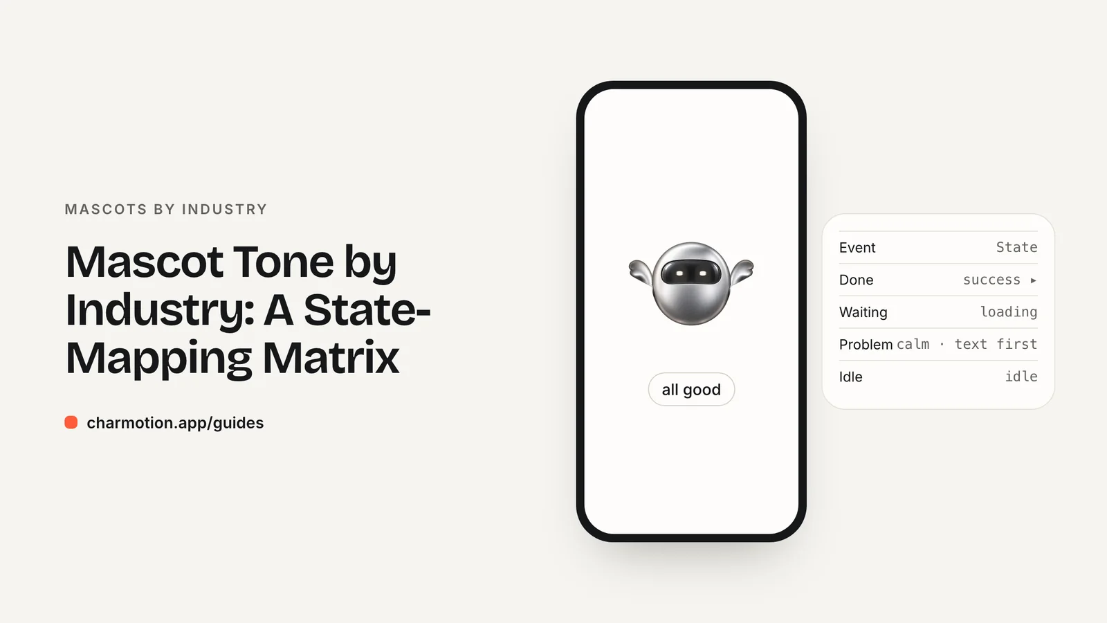
Set mascot playfulness by the stakes of each screen, not by the brand alone. Kids, education and fitness apps can be highly playful, security apps moderately, and finance and health apps should stay low-key. In every industry, keep playful motion off bad news, warnings, disclosures and consent screens, and let plain text carry critical information.
Key takeaways
- Playfulness is a per-screen decision: the same mascot can wave on onboarding and stay still on a failed payment.
- NN/g found a conversational tone helped a bank but a humorous tone hurt an insurer's credibility, so test tone in serious categories.
- Never let the mascot be the only signal of a status; text and icons carry the meaning, the character sets the tone.
- WCAG 2.2.2 and reduced-motion settings apply in every industry, whatever the brand personality.
Already have a character or logo? Preview your own character animated in a phone splash, a website hero and an empty state — free, in your browser, nothing uploaded.
How playful should a mascot be in each industry?
The right level of playfulness depends on what the user stands to lose on a given screen. Where mistakes cost money, health or safety, users want competence first. Where the product is a game, a lesson or a workout, personality is part of the value.
Research on tone supports this split. In a Nielsen Norman Group study, a more conversational banking site was rated friendlier, slightly more trustworthy and more likely to be recommended than a formal one, while a humorous insurance site was described as "too chummy" and lost credibility. NN/g also found that 52% of the variability in desirability scores was explained by trustworthiness (NN/g).
| Industry | Playfulness | Never animate playfully during | Core states |
|---|---|---|---|
| Fintech and crypto | Low to medium | Failed payments, fraud alerts, disclosures | loading, success, attention |
| Kids and education | High | Data, consent and privacy screens | yes, no, happy, sleeping |
| Health | Low | Bad news, urgent advice, disclaimers | listening, thinking, talking |
| VPN and security | Medium | Breach or leak alerts | loading, success, attention |
| Fitness | High | Injury and rest warnings | success, happy, sleeping |
Each row has its own guide: fintech, kids and education, healthcare chatbots, VPN and security and fitness.
Which moods are off-limits in finance, health and security?
No state is banned outright. What is off-limits is a state on the wrong screen. Three patterns cause most of the damage:
- Sad on the user's loss. A sad or crying character next to a declined card, a bad test result or a breach notice turns the user's problem into the mascot's feelings. Use neutral idle, or hide the character.
- Celebration near risk. Confetti-style success on a trade, a loan approval or a "you're protected" banner can read as pressure or overpromising. Keep success short and factual.
- Urgent motion on warnings. Shaking, bouncing or flashing makes a warning feel like scareware. A calm attention loop next to clear text is enough.
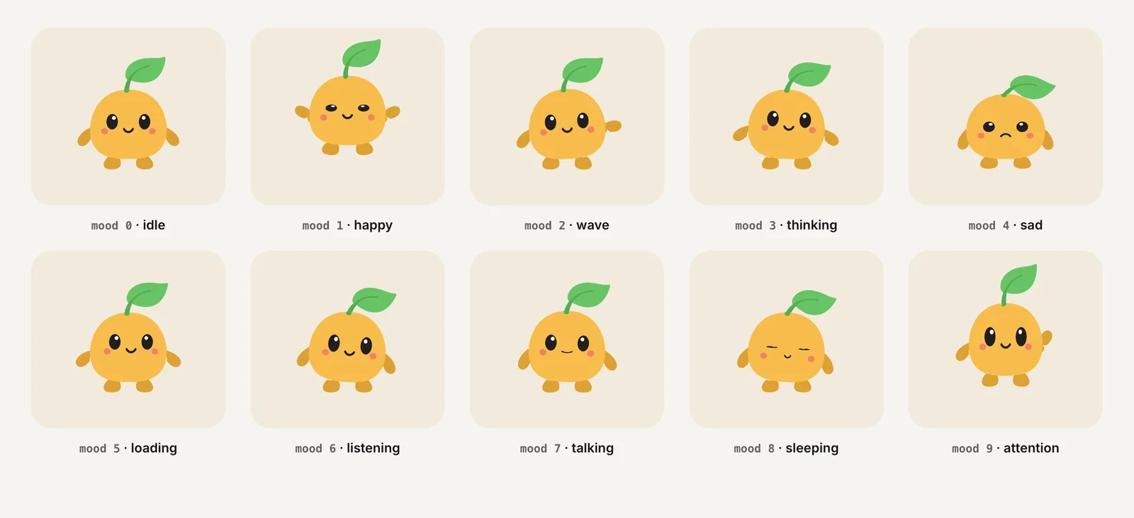
The sad loop (mood 4 in a standard ten-loop set) still has uses: a playful "no results" screen in a game, or a lighthearted empty cart. In serious categories, reserve it for low-stakes, non-personal moments or leave it out of the product entirely.
The same caution applies to copy. NN/g advises against humor in error messages because it goes stale when users see the error often, and against phrasing that blames the user (NN/g).
How do error and success states differ by industry?
Success and error are the two one-shots every app fires most, and they carry the most tone risk. A useful habit is to define them per industry before any animation is made.
| Industry | Success treatment | Error treatment |
|---|---|---|
| Fintech and crypto | Short success one-shot, then idle; amount and recipient in text | Error one-shot or none, then attention; text states the next step |
| Kids and education | yes on correct answers, success on lesson complete | Brief no, back to idle; never loop sad on repeated mistakes |
| Health | Rarely needed; a quiet yes when a form is saved | No character reaction; plain text and a clear way forward |
| VPN and security | success when protection is restored, then a calm happy loop | attention loop with a "Not protected" label and one action |
| Fitness | yes per set, success at workout end, bigger moments for milestones | Encouraging idle on a missed day, no guilt |
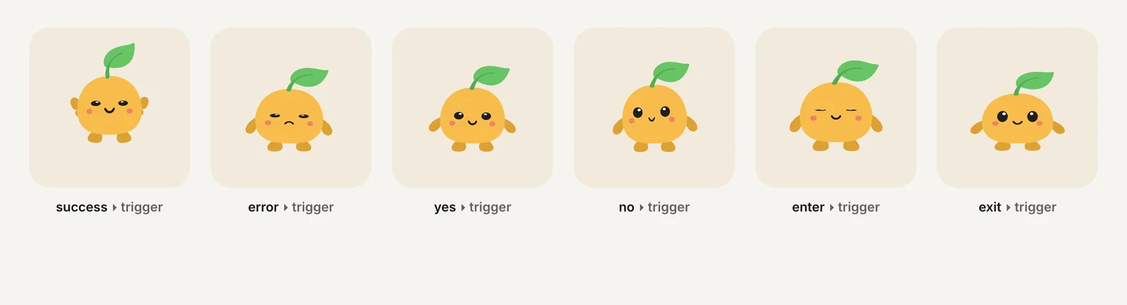
Notice that the error column rarely uses the error animation itself in serious categories. An error one-shot that looks cartoonishly upset works in a game; in a bank it can feel flippant. If you keep it, check that it reads as "something went wrong" rather than "oops."
How do I write mascot motion guidelines?
Motion guidelines are a short internal document that tells designers, engineers and writers which state goes where. Without one, each team picks whatever animation looks fun, and the mascot drifts into the wrong moments.
A workable guideline fits on one page and answers four questions:
- Where may the mascot appear? List screens explicitly, and list the screens where it must never appear (legal text, consent, critical alerts).
- Which state goes with which event? One table, one row per event, with the state, whether it loops or plays once, and what it returns to.
- What copy goes with each state? The mascot sets tone; the text carries meaning. Write the text first.
- What happens with reduced motion? Name the static pose for every state.
Review the guideline whenever a new feature adds a screen. The most common failure is not a bad animation but a good animation reused on a screen nobody planned for, such as a celebration loop that ends up on a refund confirmation.
If the mascot also appears in marketing, keep a separate, looser rule set for ads and social posts. Advertising research on brand characters, like System1's, covers that context, not in-app behavior.
How do accessibility rules apply across industries?
Accessibility requirements do not change with the industry. Three rules matter for every mascot:
- Pause, stop, hide. Under WCAG 2.2.2, moving content that starts automatically, lasts more than five seconds and sits alongside other content needs a way to pause, stop or hide it (W3C). A looping idle or attention state next to a form qualifies.
- Reduced motion.
prefers-reduced-motiontells you the user asked the system to minimize non-essential motion (MDN). Show a static pose instead, and keep the text status unchanged. - Not the only signal. A mascot's expression cannot be the only way a status is conveyed. Pair every state with text, and do not rely on color alone.
These rules matter most where tone is most delicate. A user who has just received bad news, or who has a vestibular disorder, should never have to watch a bouncing character to find out what happened.
For implementation details, see accessible animation and reduced motion.
Can one mascot cover playful and serious moments?
Yes, if the state set is wide enough to include quiet states. A mascot that only knows how to bounce and cheer will be forced into serious screens with the wrong expression. One that also has calm idle, thinking, listening and sleeping loops can stay on screen without performing.
A practical split for a single character:
- Quiet loops for serious screens: idle, thinking, listening, sleeping.
- Expressive loops for low-stakes screens: happy, wave, talking.
- Signal loops: loading and attention, used with text.
- Reactions: success, error, yes, no, enter and exit, each kept short.
Charmotion's standard set follows this structure: you upload a character, mascot or logo and get 17 animations in about 1–2 hours, with ten loops selected by a mood number (0–9), six one-shot triggers and a launch intro, in one .riv plus MP4, GIF and transparent video. The tone decisions in this guide still belong to you; the file only makes every state available.
For the full list of states and what each is for, read mascot animation states.
How to write industry-appropriate mascot motion guidelines
- Rate each screen's stakes. List every screen where the mascot could appear and mark it low, medium or high stakes based on what the user can lose there.
- Exclude high-risk screens. Remove the mascot from legal text, consent flows and critical alerts, or limit it to a static or calm attention pose.
- Map events to states. Write one table row per event with the state, whether it loops or plays once, and the loop it returns to.
- Write the copy first. Draft the text for each state so the message is complete without the character, then pick the motion that matches it.
- Define reduced-motion poses. Choose a static pose for every state and add a pause control for loops longer than five seconds.
Frequently asked questions
Which industries should avoid mascots?
None need to avoid them entirely, but finance, health and security should keep them restrained and away from bad news, warnings and legal text. NN/g found a humorous tone hurt an insurer's credibility, so test tone carefully in any category where trust drives the decision to use the product.
Should a mascot ever look sad?
Only in low-stakes, non-personal moments, such as a playful empty state in a game. Avoid a sad face on the user's own loss, like a declined payment or a bad result, and never use it to guilt users into staying or turning reminders back on.
Is a mascot an accessibility problem?
Not if it is built correctly. Give looping animation a pause or stop control under WCAG 2.2.2, show a static pose when reduced motion is on, and make sure every status the mascot shows is also stated in text that screen readers can announce.
Quick answers from this guide
Sources
- The Impact of Tone of Voice on Users' Brand Perception — Nielsen Norman Group
- Error-Message Guidelines — Nielsen Norman Group
- Understanding SC 2.2.2: Pause, Stop, Hide — W3C WAI
- prefers-reduced-motion — MDN Web Docs
- Celebrities v. fluent devices: how recurring brand characters drive lasting consumer connections — Advertising Week