Turn Your App Icon Into a Launch Intro
By the Charmotion team · Updated
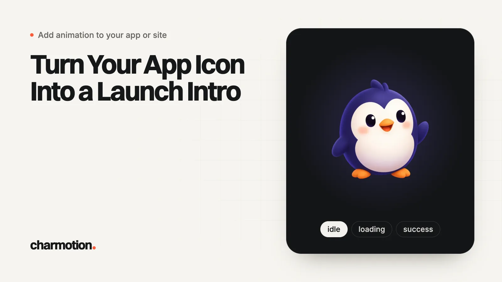
To turn an app icon into a launch intro, keep the OS launch screen static with the resting icon on your brand color, then play a short intro on the first screen that starts and ends on that exact icon, so the seam disappears. 3D or gradient icons can be moved as whole images with squash, tilt and hop instead of being redrawn.
Key takeaways
- The intro plays on your first screen; the OS launch screen only shows the still icon.
- Match size, center and background hex between the launch screen and the intro's first and last frames.
- One motion is enough: pop in, squash on landing, settle. Keep the part that blocks the user to about a second.
- 3D, gradient and text icons are best moved as a whole image, not traced into vectors.
- Skip the intro under reduced motion and on fast warm launches.
Already have a character or logo? See your character in real app screens: splash, onboarding, loading and empty-state screens. It's free, runs in your browser and uploads nothing.
What is an app icon launch intro?
It is a one- to three-second animation of the icon people just tapped, played on your first screen right after the static launch screen. It is the honest version of an "animated app icon": iOS and Android don't let you animate the Home Screen icon (see can you animate an app icon), but they do let your app animate anything once it is running.
Apple's HIG says the launch screen should be nearly identical to your first screen and isn't a branding opportunity (Apple HIG). An icon intro respects that: the launch screen stays plain, and the brand moment happens in the app, briefly, ending on a state the next screen can use.
For the platform rules behind launch screens on iOS, Android and the web, read app launch and splash screen animation. This guide is about the icon itself: what motion to give it and how to make the frames line up.
What motion works for an app icon intro?
Pick one clear action and make it physical. Icons are small, solid shapes, so motion that treats them as objects reads best:
- Pop in with overshoot: scale from about 60% to slightly past 100%, then settle.
- Squash and stretch on landing: a short drop or hop with a squash as it lands makes the icon feel heavy and real.
- A small tilt: a few degrees of rotation and back adds life without changing the silhouette.
- Blink, if the icon has eyes: one blink at rest is often the most charming beat.
Keep the part that delays the user short. Google recommends that the Android splash icon animation not exceed 1,000 ms (Android Developers), and about one second is the limit for keeping a user's flow of thought uninterrupted (NN/g). If your intro runs longer, fade the interface in during its final part so people can act before it ends.
How do you match the intro to the static launch screen?
The launch screen is a still frame of your intro. Pick one of two setups and stick to it:
| Setup | Launch screen shows | Intro starts | Intro ends |
|---|---|---|---|
| Icon reveal | Background color only | Empty, icon pops in | Resting icon |
| Icon comes alive | Resting icon on the background | Resting icon (anticipation squash, hop) | Resting icon |
For "icon comes alive", the resting icon must sit at the same size and center in both places. On iOS, UILaunchScreen takes a color and an image, and a launch storyboard may only use standard UIKit classes (Apple Developer Documentation). On Android, the static splash icon is 288×288 dp with its content in a 192 dp circle, or 240×240 dp in a 160 dp circle with an icon background, so the intro's icon must be drawn at that visible size.
Use a named color asset or a single hex value for every background, and check light and dark mode separately. A one-shade mismatch is the most common reason a handoff looks like a blink.
Can you animate a 3D or gradient app icon?
Yes, if you move it rather than rebuild it. Tracing a glossy 3D icon, a mesh gradient or lettering into vector shapes changes how it looks, and that is the one thing a brand cannot accept. Instead, treat the icon as a single image and animate its transform: scale, rotation, position and non-uniform scale for squash and stretch. The pixels never change, so the icon at rest is exactly the icon on the Home Screen.
That is how Charmotion handles these icons. Upload one PNG, JPEG or WebP (at least 512 px): flat art gets a vector rig, while 3D, gradient and text icons go to Motion mode, which removes the background and animates your exact artwork with squash, stretch, tilt, hops and blinks where it finds eyes. Either way you get a 2.6-second launch intro that ends on the resting icon, plus 16 other animations (looping moods and one-shot reactions), as a Rive file with LaunchStateMachine, transparent WebM and HEVC MOV, MP4, GIF and a 9:16 launch video. Sets come with the paid plans (from $20/month) and usually take a few minutes. It does not produce Lottie or AnimatedVectorDrawable files. The free preview shows your icon in app screens and, for flat art, a short animated test clip first.
Which format should the icon intro ship in?
| Platform | Intro format | Notes |
|---|---|---|
| iOS (SwiftUI, UIKit) | .riv, or HEVC MOV with alpha | Apple platforms decode HEVC with alpha (WWDC19). See animated splash in SwiftUI. |
| Android | .riv in the first activity; optional AVD in the system splash | See Android splash icon. |
| Expo, React Native | .riv (development build) or video | See Expo splash. |
| Flutter, FlutterFlow | .riv or video | See Flutter splash. |
| Website hero | VP9 alpha WebM plus HEVC alpha MOV, or .riv | See website and launch video. |
Whatever the format, check how your code knows the intro is over. Video players and Lottie report completion. A Rive state machine only reports what its author built in, so if your launch file has no end event, wait for the intro's length with a timer.
When should the launch intro play?
- Cold starts, not every resume. Coming back from the background should show the app immediately.
- Full intro on first launch, shorter later. Consider the full version after install or an update, and a quick settle on daily launches.
- Never pad a fast launch. If the app is ready, let people interact while the last frames finish.
- Respect reduced motion. Show the resting icon and continue. In SwiftUI read
accessibilityReduceMotion(Apple); on the web,prefers-reduced-motion. - Reuse it outside the app. The same intro makes a strong first second for your store preview and launch video.
How to turn your app icon into a launch intro
- Choose the setup. Decide whether the launch screen shows only your background color (icon reveal) or the resting icon (icon comes alive).
- Animate one motion. Give the icon a pop-in, hop or squash that ends on the exact resting icon, keeping the blocking part to about a second.
- Match the frames. Use the same background hex and the same icon size and center on the launch screen and in the intro.
- Play it on the first screen. Bundle the .riv or video, start it as the first screen appears, and continue after its length.
- Add the fallbacks. Skip it under reduced motion and on warm resumes, and add a safety timeout if the file fails to load.
Frequently asked questions
Should the launch intro end on the icon or on the app's first screen?
End on the resting icon, then let the interface appear around it or move the icon into its place, such as a navigation bar logo. Ending on a different pose forces a cut, which is exactly the seam you are trying to hide.
Can I use the same icon intro in my App Store preview?
Yes, if it appears as part of a screen capture of your app. Guideline 2.3.4 says previews may only use video screen captures of the app itself, with narration and overlays allowed. An intro your app really plays at launch qualifies.
Will a launch intro slow down my app's startup?
It adds time only if you make the user wait for it. Load the file while the static launch screen is still visible, start the intro when your first screen appears, and let the interface accept input during its final part. Skip it on warm resumes.
Sources
- Launching, Apple Human Interface Guidelines
- Specifying your app's launch screen, Apple Developer Documentation
- Splash screens, Android Developers
- Response Times: The 3 Important Limits, Nielsen Norman Group
- HEVC Video with Alpha (WWDC19), Apple Developer
- accessibilityReduceMotion, Apple Developer Documentation
- App Review Guidelines (2.3.4, 2.3.8, 2.5.1), Apple