VPN and Security App Mascots: Protected vs Exposed
By the Charmotion team · Updated
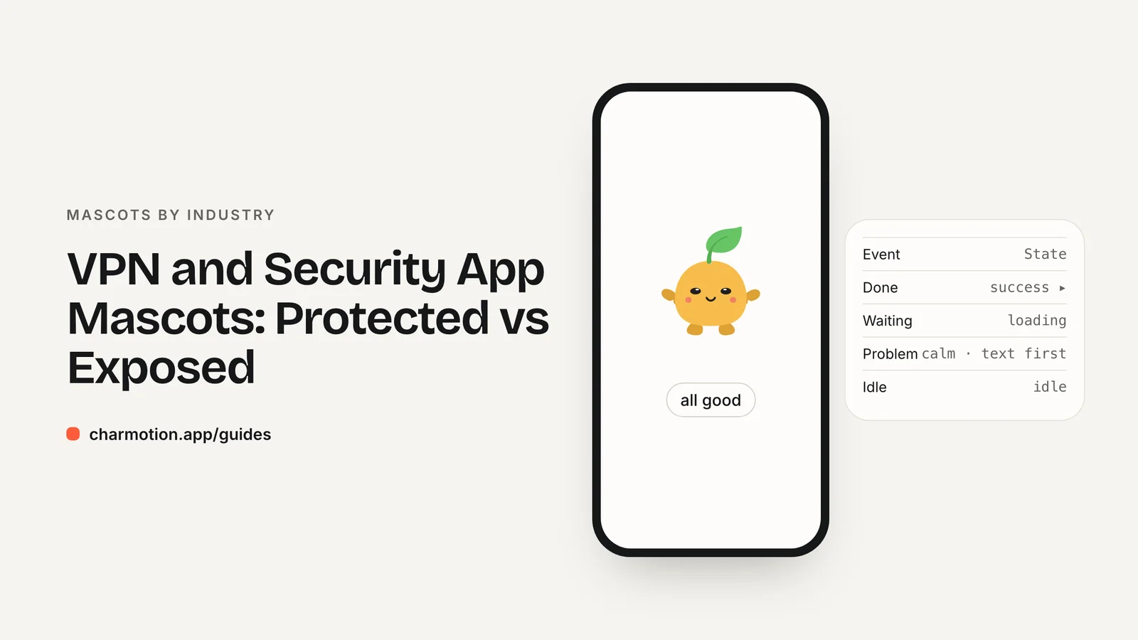
A VPN or security app mascot should make protection status easier to read without frightening users. Use loading while connecting, a success reaction when protected, and a calm attention loop when exposed, always next to a plain text label like Not protected. Avoid red flashing, shaking and alarm-style motion, which make real warnings look like scareware.
Key takeaways
- VPNs have long used cute mascots to make an abstract, intimidating technology feel relatable and harmless.
- The status label carries the meaning; the mascot only sets the tone and must never replace the text.
- Use attention, not shaking or flashing, for disconnected and kill-switch states; celebrate only when protection is restored.
- Flashing must stay under WCAG 2.3.1 thresholds, and color cannot be the only status signal.
Already have a character or logo? Preview your own character animated in a phone splash, a website hero and an empty state — free, in your browser, nothing uploaded.
Why do VPN apps use cute mascots?
Security tools ask users to trust something they cannot see. A friendly character makes that ask easier. In a 2017 media-studies essay, Juan Llamas-Rodriguez notes that VPN avatars such as TunnelBear's bear, Mullvad's gopher and SlickVPN's chameleon "both signal the service's relatability to the everyday user and imply its innocuous nature" (Flow).
That second part is worth noticing. Cuteness implies harmlessness, which helps when the product is unfamiliar. It can also work against you if the character makes a real risk look harmless. A cheerful mascot next to "Your connection is not protected" sends a mixed message.
So the design job in a security app is double: use the character to make setup and everyday status friendly, and make sure it never softens a warning the user needs to act on.
The same thinking applies to password managers, antivirus tools and account-security screens. The character can make security feel approachable; it should never make insecurity feel acceptable.
Which mascot states map to connecting, protected and exposed?
Connection state is a small state machine on its own, which maps cleanly onto mascot loops and one-shots:
| Event | State | Loop or one-shot | Notes |
|---|---|---|---|
| App opened | enter, or launch intro once | One-shot | Then the loop for the current status |
| Disconnected | idle (0) | Loop | Calm, with a clear "Not protected" label and a Connect button |
| Connecting | loading (5) | Loop | Show the server or location in text |
| Connected | success, then happy (1) | One-shot, then loop | Settle into a low-motion loop quickly |
| Connection dropped | attention (9) | Loop | No shaking or red flashing |
| Kill switch blocking traffic | attention (9) | Loop | Text explains that traffic is paused on purpose |
| Disconnect by user | exit, then idle (0) | One-shot, then loop | Neutral; the user chose this |
| Long idle while protected | sleeping (8) | Loop | Optional low-motion state for widgets |
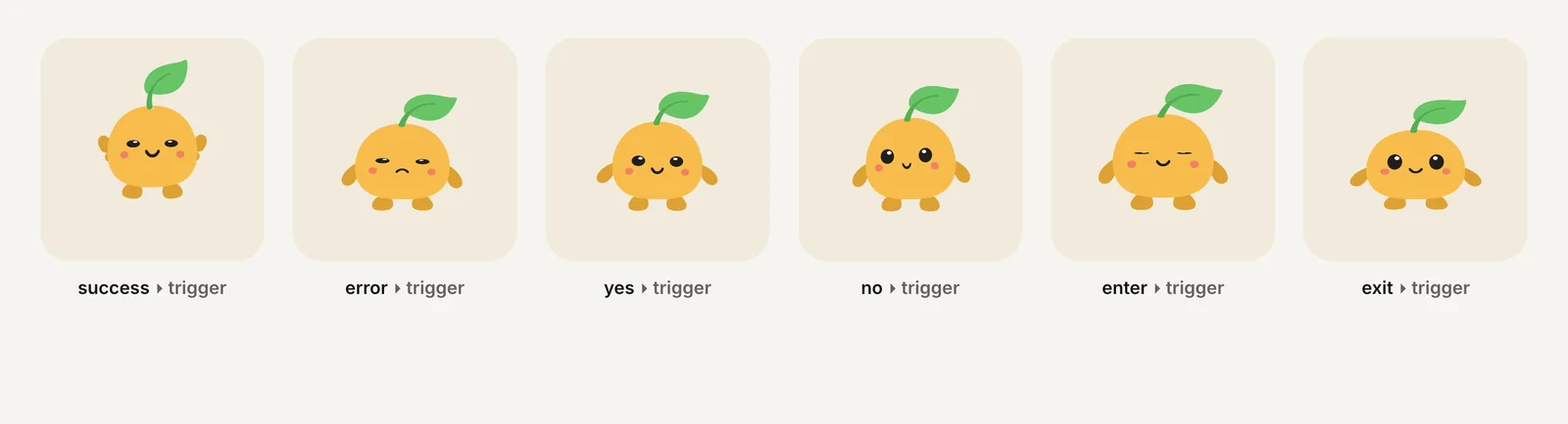
Leave out sad (4) for disconnected states. Being unprotected is a status, not a failure, and a sad character nudges users with guilt rather than information.
A shield-shaped character makes the "protected" metaphor literal without needing alarm imagery.
How do I show disconnected without fearmongering?
The goal is for users to understand their status and act on it, not to feel scared into upgrading. A calm pattern works better:
- State the fact. "Not protected" or "VPN off" in plain text, near the top of the screen.
- Offer one action. A single Connect button, not a stack of upsells.
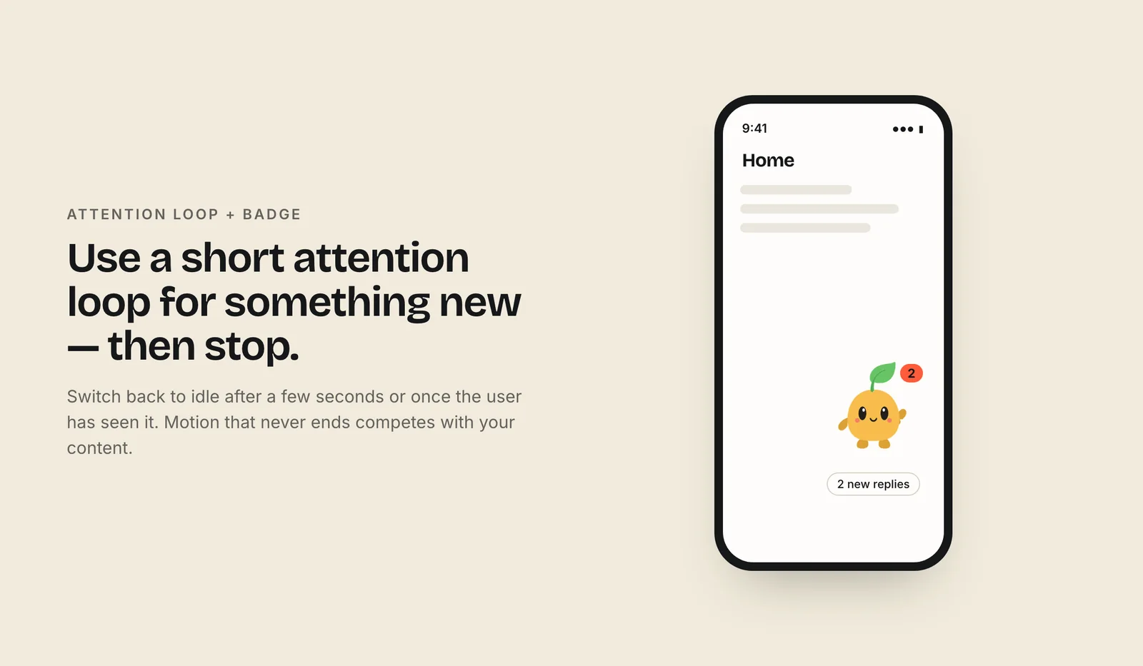
- Use attention, not alarm. An attention loop draws the eye without implying danger. Save stronger visual treatment for real incidents.
- Celebrate restoration, not fear. The success reaction plays when protection returns, so the positive moment is tied to the user's action.
Avoid patterns that look like scareware: countdowns, red pulsing backgrounds, shaking icons and fake "threats detected" counters. They train users to distrust your alerts, which is the opposite of what a security product needs.
If the attention loop runs for more than five seconds alongside other content, WCAG 2.2.2 requires a way to pause, stop or hide it (W3C). A settled, static attention pose after a few cycles is an easy way to comply.
How do I avoid scareware-style alarm animation?
Alarm-style motion has two problems: it erodes trust, and it can be an accessibility hazard.
On the accessibility side, WCAG 2.3.1 requires that content not flash more than three times in any one-second period unless it stays below the general and red flash thresholds (W3C). Red flashing is specifically called out because saturated red flashes carry extra risk. A pulsing red warning badge can fail this criterion.
On the trust side, motion that looks urgent should be reserved for events that are urgent and actionable. A practical scale:
- Routine status (connected, disconnected by choice): idle or happy, no extra emphasis.
- Needs attention (connection dropped, kill switch active): attention loop plus text and one action.
- Real incident (credentials found in a breach, suspicious sign-in): hide the mascot or freeze it; use a standard alert with clear text and steps.
Notice that the mascot's role shrinks as the stakes rise. That is deliberate. At the top of the scale, users need a plain instruction, not a character's reaction.
How do I pair mascot states with clear text and icons?
The mascot is a supporting signal. The status must be complete without it.
- Text first. Every state has a label: "Not protected," "Connecting to Frankfurt," "Protected," "Traffic paused by kill switch."
- Do not rely on color. WCAG 1.4.1 says color must not be the only visual means of conveying information (W3C). Green and red alone fail users with color vision deficiencies; pair them with text and distinct icons.
- Keep the icon system separate. Status icons in the toolbar and widgets should not depend on the mascot's expression.
- Announce changes. Status changes should reach screen readers as text, independent of animation.
- Static fallback. With reduced motion on, show a static pose that matches the status.
Charmotion delivers the states in this guide, including loading, success, attention, idle, sleeping, enter and exit, in one .riv with a mood number and triggers, plus transparent WebM and MOV for websites. Motion mode keeps the exact pixels of 3D or AI-generated shield and logo artwork, which suits security brands that already have a polished mark. Aegis, a glass shield from Charmotion's demo set, is an example of that kind of character.
Should the mascot appear on breach or leak alerts?
Generally no, or only as a static figure. A breach or leak notice asks the user to do something important, such as change a password, revoke a session or enable two-factor authentication. Anything that competes with those instructions makes the alert less effective.
If your brand guidelines require the character on every screen, use a frozen neutral pose placed away from the action buttons. Do not use:
- error or sad reactions, which shift focus to the mascot's feelings;
- attention loops next to the instructions, which compete with them;
- success reactions until the user has actually completed the recommended steps.
Once the user finishes the steps, a short success reaction is appropriate. It confirms that the action worked and ties the positive moment to the user's own effort.
The same principle runs through every serious category: the character reacts to what the user did, not to the bad news itself. See mascot tone by industry for how this compares to finance and health.
How to map a security app's status to mascot states
- List every status. Write down each connection or protection status, including disconnected, connecting, connected, dropped and kill-switch states.
- Write the label for each. Give every status a plain text label and one action, so it is complete without the mascot.
- Assign calm states. Use idle for disconnected, loading for connecting, success then happy for connected, and attention for drops and kill switch.
- Remove alarm motion. Drop shaking, red flashing and countdowns, and keep any flashing under WCAG 2.3.1 thresholds.
- Handle incidents separately. Hide or freeze the mascot on breach and suspicious sign-in alerts, and play success only after the user completes the fix.
Frequently asked questions
Why do so many VPN apps use cute mascots?
Cute characters make an abstract, slightly intimidating technology feel approachable. A 2017 Flow essay notes that mascots like TunnelBear's bear and Mullvad's gopher signal relatability and imply the service is harmless. Pair them with clear text states so the character never replaces the status label.
How do I show 'not protected' without scaring users?
Use a calm attention loop and plain text instead of red flashing, shaking or alarm sounds. Show Not protected next to one clear action, such as a Connect button, and play a success reaction only when protection is restored. Pause long loops to meet WCAG 2.2.2.
Should a password manager have a mascot?
It can, for onboarding, empty vaults and confirmations like a saved password. Keep it hidden or static on breach alerts and security warnings, where users need clear steps. The character should make security approachable, never make a real risk look harmless.
Quick answers from this guide
Sources
- The Cuteness of Tunneling Media — Flow Journal
- Understanding SC 2.2.2: Pause, Stop, Hide — W3C WAI
- Understanding SC 2.3.1: Three Flashes or Below Threshold — W3C WAI
- Understanding SC 1.4.1: Use of Color — W3C WAI
- prefers-reduced-motion — MDN Web Docs