Animation Durations & Loading UX Guidelines
By the Charmotion team · Updated
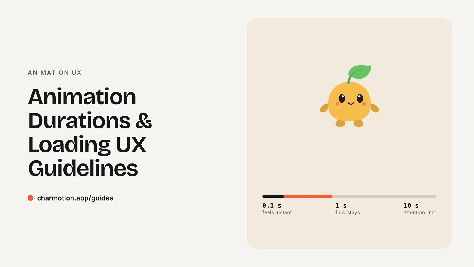
Most mobile UI transitions should last about 200–300 ms. Material Design suggests about 225 ms for elements entering, 195 ms for leaving and up to 375 ms for large full-screen changes, and warns that over 400 ms may feel slow. For waits, show nothing under a second, a looping indicator for 2–10 seconds and a progress bar beyond 10.
Key takeaways
- Nielsen's limits: 0.1 s feels instant, 1 s keeps flow, 10 s is the edge of attention.
- Typical mobile transitions run about 300 ms; anything past 400 ms can feel sluggish.
- Material 3 duration tokens range from 50 ms to 1,000 ms; bigger movement gets longer durations.
- Use looping indicators for 2–10 second waits and percent-done progress for 10 seconds or more.
- End loops when work ends, and keep attention loops from running indefinitely.
How long should UI animations be?
Short. Material Design's original motion guidance says transitions on mobile typically take around 300 ms, and gives more specific values:
| Motion | Suggested duration |
|---|---|
| Element entering the screen | 225 ms |
| Element leaving the screen | 195 ms |
| Typical mobile transition | about 300 ms |
| Large, full-screen transition | about 375 ms |
| Tablet | about 30% longer |
| Wearable | about 30% shorter |
The same guidance notes that transitions exceeding 400 ms may feel too slow. Exits are faster than entrances because the user has already decided to move on.
Material 3 expresses this as duration tokens, from short1 at 50 ms up to extraLong4 at 1,000 ms, in 50 ms steps up to 600 ms and then 700–1,000 ms. The rule attached to them: "duration should increase as the area/traversal of an animation increases." A checkbox tick sits at the short end. A full-screen container transform sits near the long end.
These numbers are for interface transitions that block the user's next step. Ambient character loops are different, and are covered below.
What do the 0.1 s, 1 s and 10 s limits mean?
Jakob Nielsen's three response-time limits, published by Nielsen Norman Group, are the standard reference for how waiting feels:
- 0.1 second: about the limit for the user to feel the system is reacting instantly. No feedback beyond showing the result is needed.
- 1 second: about the limit for the user's flow of thought to stay uninterrupted. They notice the delay but keep their focus.
- 10 seconds: about the limit for keeping attention on the task. Beyond it, people start doing other things while they wait.
Use them as design thresholds. Under 0.1 s, a press state is enough. Between roughly 1 and 10 seconds, show that something is happening. Beyond 10 seconds, show how much is left, and ideally let the user leave and come back.
The limits also explain why long UI transitions hurt. A 600 ms screen transition on every tap spends over half of the 1-second budget on decoration before any content appears.
When should I show a spinner, a progress bar or a loading animation?
Nielsen Norman Group's progress-indicator guidance maps cleanly to wait length:
| Expected wait | What to show |
|---|---|
| Under about 1 s | No indicator; it would only flash. Respond to the tap immediately. |
| About 2–10 s | A looping indicator: a spinner or an animated loading character. |
| 10 s or more | A percent-done progress bar, ideally with time remaining. |
A loading mascot is a looping indicator with more personality. It fits the 2–10 second band, such as an upload, a search or an AI response. It does not replace a progress bar for long jobs, because a loop cannot tell the user how far along the work is. For long waits, pair the character with a real percent-done bar.
Skeleton screens are a third option for content that loads into a known layout. They show gray placeholder blocks shaped like the coming content, which tells the user what to expect rather than how long it will take. Use them for feeds and lists, and keep a character loop for actions the user started.
How should loops and one-shot reactions be timed?
Character animation splits into two kinds, and they need different timing.
Loops (idle, loading, listening, talking) repeat while a state is active. Their cycle length matters less than smoothness. A loop of a few seconds, with a seamless join and low-amplitude movement, reads as calm. Short, fast loops read as nervous. A loop's job is to say "still here" or "still working" without pulling the eye from the content.
One-shots (success, error, yes, no, enter, exit) play once and return to the current loop. They communicate a result, so they should land quickly. There is no authoritative standard length for a success animation; aiming for well under a second for the readable part keeps it inside Nielsen's 1-second flow limit, and Material 3's longest duration token is 1,000 ms.
A Rive state machine handles this split well. In a Charmotion set, a number input called mood (0–9) selects the active loop, and triggers fire one-shots that return to the current mood when they finish. Your code only says what happened; the file handles the timing. See Mascot Animation States for the full list.
How long should an attention animation run?
Not forever. An attention loop, such as a mascot waving next to a new notification, works because it moves while everything else is still. If it never stops, people learn to ignore it, and it competes with whatever they are trying to read.
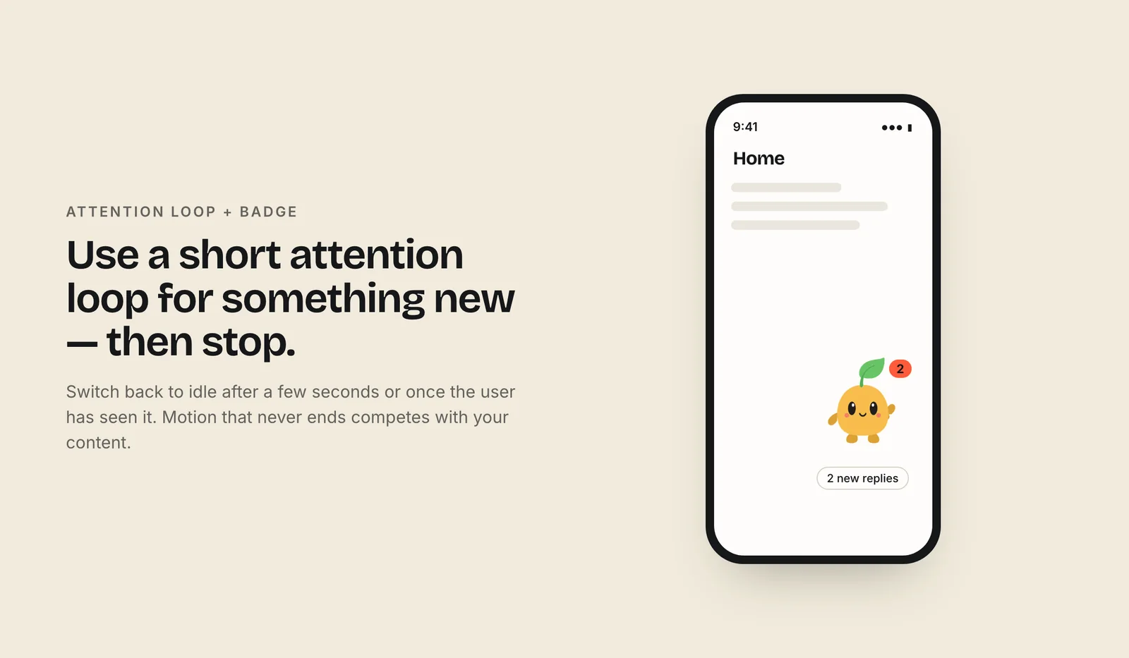
There is also a compliance angle. WCAG 2.2 SC 2.2.2 Pause, Stop, Hide (Level A) applies to moving content that starts automatically, lasts more than five seconds and is shown alongside other content. A practical pattern is to play the attention loop for a few seconds, keeping the total under five, then drop back to idle or a still pose until something new happens.
The same thinking applies to loading. Stop the loop the moment the work finishes, and end on a one-shot result so the user sees the outcome rather than a sudden cut. If the wait runs past 10 seconds, switch from the loop to a progress indicator.
Finally, respect prefers-reduced-motion. For users who ask for less motion, attention can be a color change, a badge or a still pose. The reduced-motion guide covers the implementation.
How do I keep loading animations from feeling slow?
- Respond in under 0.1 s. Show a press state or start the loading animation immediately so the tap feels acknowledged.
- Delay indicators for very short waits. If a request usually finishes in under a second, wait a moment before showing a spinner so it does not flash on and off.
- Do not hold results for the animation. When the data arrives, end the loop. Never make users wait for a cycle to finish.
- Keep the outro short. The success or error reaction should land quickly; follow the sub-second guidance above.
- Show progress for long jobs. Past about 10 seconds, a percent-done bar tells users how long they have; a loop alone does not.
- Keep transitions inside the budget. Use roughly 200–300 ms for screen changes so animation does not eat the 1-second flow window.
Motion should make waiting legible, not longer. If removing an animation would make the product feel faster, it is probably too long.
Frequently asked questions
What is the best duration for a button or micro-interaction?
Short. Material 3's shortest duration tokens start at 50 ms, and small elements belong at the short end because duration should grow with the area an animation covers. Most taps should show feedback within 0.1 s, the limit Nielsen gives for feeling instantaneous.
Should I use a spinner for a 1-second wait?
Usually not. Nielsen Norman Group advises no indicator for actions under about a second, since a spinner would flash briefly and add noise. Reserve looping indicators for waits of about 2–10 seconds and percent-done progress bars for 10 seconds or more.
Can an animated mascot replace a progress bar?
Only for short, indeterminate waits of about 2–10 seconds. A looping animation cannot show how much work is left, so for waits of 10 seconds or more, NN/g recommends a percent-done indicator. You can pair the character with a progress bar.
Why do exit animations run faster than entrances?
Material Design suggests about 195 ms for elements leaving the screen versus 225 ms for entering. The user has already chosen to move on, so a quick exit gets out of the way, while an entrance needs a bit more time to be noticed and understood.
Sources
- Response Times: The 3 Important Limits — Nielsen Norman Group
- Progress Indicators Make a Slow System Less Insufferable — Nielsen Norman Group
- Duration & easing — Material Design (M1)
- Motion theming (duration tokens) — Material Components for Android
- Understanding SC 2.2.2: Pause, Stop, Hide — W3C WAI
- Inputs (web runtime, legacy) — Rive